
The website design process has a reputation it doesn’t entirely deserve. People hear “website project” and picture a black box: you hand over your logo and your hopes, and sometime later a finished site appears — or doesn’t, or does but isn’t quite what you imagined. That’s not how we work. Our process is a transparent, collaborative sequence with defined phases, real checkpoints, and room for your voice at every turn. You are not a passenger here.
Before we walk through the phases, a word about the philosophy underneath them — because how we build is as deliberate as what we build. We work in WordPress, starting from a lean, stripped-down framework that loads fast and stays flexible. We think of a website the way a software developer thinks of an application: content lives in a database, not scattered across disconnected pages. That means if you maintain a list of staff members, or events, or programs, you enter that information once and it flows wherever it’s needed across the site. Blocks — the modular units we use to assemble pages — are customized to do exactly one job well, whether that’s displaying a team member’s bio, surfacing a relevant document, or pulling a quote. We avoid feature-bloated tools because, in our experience, complexity breaks, and broken things are hard to fix and harder to trust. Lean tools, properly fitted to your actual needs, outlast impressive-sounding ones that were never quite right for the job.
With that foundation in place, here is how the work actually unfolds.
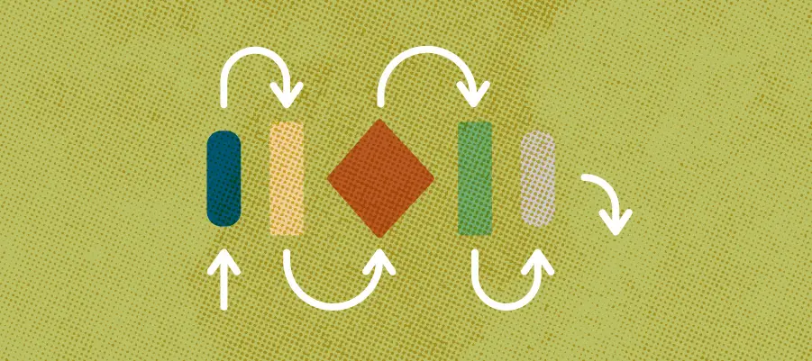
Planning. Every project begins with a real conversation about why you need this website and what you’re trying to accomplish. Audience, services, resources, constraints — we want to understand the full picture before we draw a single box. The question this phase answers: what are we actually trying to do here?
Sitemap and Wireframing. Once we understand the goal, we build a visual sitemap so everyone shares the same mental model of the site’s structure. Then we create wireframes — simplified, undesigned sketches of key pages — that show how information will be organized before we’ve committed to any visual choices. Sitemap plus wireframes together give you a bird’s-eye view of the whole: how the pieces connect, where things live, how a visitor moves through it.
Prototyping. We believe the sooner you can interact with a working version of the site, the better decisions everyone makes. So before design enters the picture, we build a functional prototype — navigation, forms, plugins, responsive behavior, all of it working as it will in the real world. It won’t be beautiful at this stage, and we’ll say so plainly. But you’ll be able to see how our solutions actually function, not just imagine them.
Design. Now comes the visual polish: typography, color, imagery, the brand language that makes the site unmistakably yours. Because the structural decisions were already made and tested, the design phase is about expression, not renegotiation. The question this phase answers: does this feel like us?
Delivery. The final phase is a careful review across desktop and mobile, a launch sequence, and — critically — training. We hand you a site you can actually maintain. Documentation, guidance, the confidence to keep your content fresh without knowing a line of code. We build for the long term, which means the real deliverable isn’t just a launched website; it’s a website your team can live in for years.
lessons learned
We learned something important about what a website can be during our work on the Power Past Coal project — a multistate campaign to prevent coal train traffic through communities across the Pacific Northwest. When we started, we thought we were building a website. What we discovered, as we got deeper into the work, was that we were building a platform for an ongoing conversation among community leaders from remarkably different backgrounds: public health advocates, safety officials, environmental organizers, local residents with very different relationships to the same issue. Hundreds of communities were touched, in profound ways, by what was being debated. This wasn’t a question of awareness alone — it was a question of focus and collective action across a sprawling, diverse coalition.
The best process serves people who manage the site as well as people who read the content they create.
The surprise was this: who was making the content turned out to matter as much as who was reading it. The diversity of voices wasn’t a complication to be managed — it was the whole point. Which meant the site had to be genuinely easy to update, not just easy in theory. And here is where we ran into something uncomfortable and true: even when we simplified as thoughtfully as we knew how, some contributors simply didn’t have the bandwidth — or the comfort — to manage a content system on their own. We had to meet them where they were. We built additional tools. We sometimes made updates ourselves. We learned, again, that the best process serves people who manage the site as well as people who read the content they create.
The campaign ultimately worked across websites, videos, maps, signage, flyers, and other materials — a chorus of deliverables that succeeded not because they carried a single unified message, but because they created space for many messages to exist and reinforce each other. No one piece of content could have carried that weight alone.
Kimberly Larson at Climate Solutions put it this way: “Shew Design is a key partner and contributor in our campaigns. They care about their clients and take care of their needs from soup to nuts.”
That’s the kind of work we want to do. Not a handoff, but a partnership — from the first planning conversation to the training session after launch, and through all the updates that come after. A website that serves you well isn’t finished when it goes live. It’s finished when you don’t need us anymore to keep it going.