


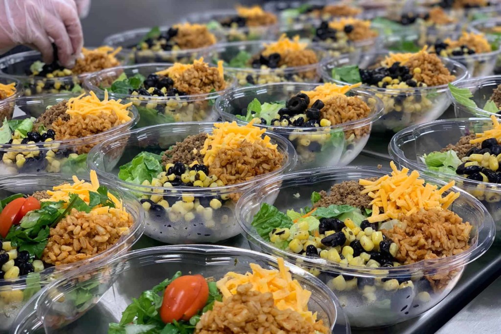

Bellingham Public Schools put a lot of thought and effort into creating a vision for creating a lifetime of healthy eating, a guide of food values, and long term goals for their new school lunch program and school campaign branding for the central kitchen. Our goal was to use this as a foundation for a brand that communicated these values and generated excitement for the new food being offered in all school cafeterias.
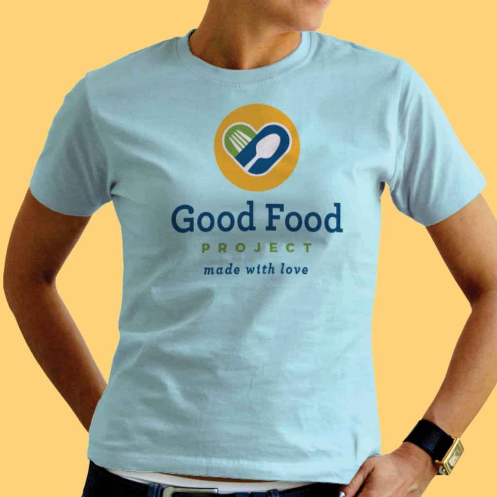
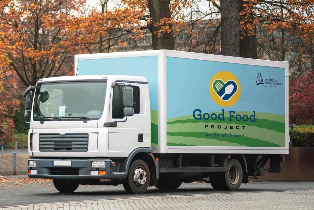
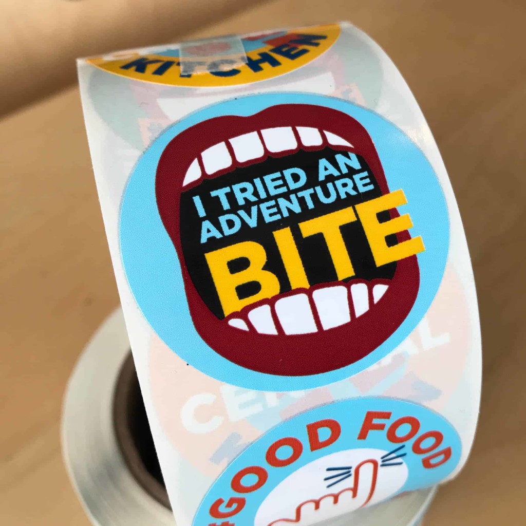
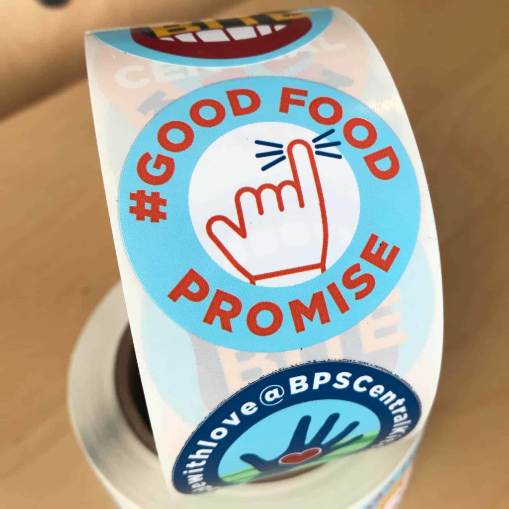
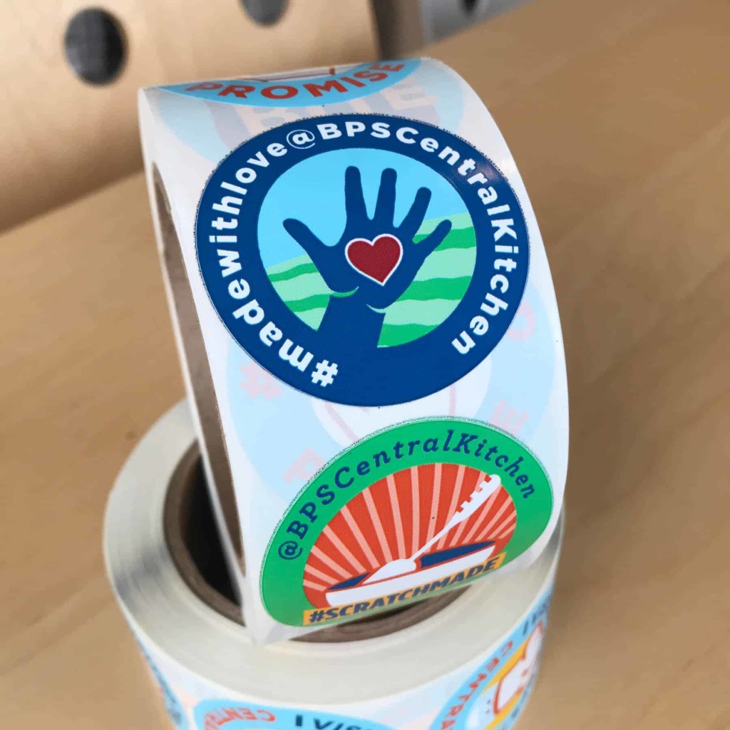
We developed their brand in the context of a diverse set of deliverables. We created and sent surveys to students, parents, and staff to learn what they liked and disliked about the school lunch program and what would encourage participation. This informed a logo and messaging that supports “Real food, made with love,” applied across everything from printed menus to food trucks to staff aprons.
Readable, approachable, and built for busy cafeterias
Typography played an important role in making the Good Food Project feel welcoming to students of all ages. We paired a friendly slab serif with a clean sans serif — a combination that feels approachable and warm without sacrificing legibility. The slab serif brings personality and a handcrafted quality that echoes the program’s scratch-made food philosophy, while the sans serif keeps things modern and easy to read. That readability was especially important for practical applications like monthly lunch calendars, where clarity at a glance matters most.
Bright, bold, and built around food
Color plays a big role in how a brand feels before a single word is read, so we were intentional about building a palette that felt energetic and welcoming. We started with the Bellingham Public Schools’ colors as our anchor, then expanded to incorporate greens and yellows — colors that evoke natural associations with fresh food, growth, and positivity. The result is a palette that feels connected to the district’s identity while giving the Good Food Project its own distinct, lively presence. Bright and uplifting, the colors signal to students and families that this program is something different — something worth being excited about.
Jacqueline Brawley
Executive Director, Communications and Community Relations
Bellingham Public Schools
We love our new Good Food Project branding in Bellingham Public Schools. Eric and Becca listened carefully to our vision and designed a beautiful, vibrant logo and assets that allow us to move our food services program forward. It is a fresh look that perfectly pairs with our new menu. They are wonderful designers and extremely responsive to our numerous and unique requests, which included a new look for our school menu, an introductory video, buttons, stickers, aprons and even vehicle graphics. In addition to being very talented, they are lovely, funny and fun people to work with.