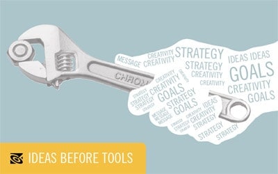
Having just completed the installation of the new version of Office, I was struck by the new default appearance of good old Microsoft Word. Documents now appear with a very minimal, non-graphical interface at the top of the screen, and a nondescript blank page below. The message of this design choice is clear: the application is about writing instead of the technology of writing – about filling a page with words instead of filling a screen with dashboards and buttons.
Even if it’s only on a screen, I like the blank page and the limitless freedom it provides. “Once you make a mark on a page,” a person at a drawing group I attended once told me gravely, “You’re doing serious business.”
I would add it’s a business that is powerfully, sometimes invisibly affected by the tools you use. For example: formatting controls may help you plan out the appearance of the document you’re making or may just distract you with meaningless choices that interfere with the writing process.
The distractions from thinking seriously about the process become greater when technology becomes the focus… especially when building websites. Thinking in terms of technology alone can lull a person into emulating others by rote. Contact page? Check. About us page? Check. It’s possible to build an entire website that follows a form, perfectly, but still says or does nothing interesting or useful.
This is a hazard everyone faces today, and I think the solution comes from thinking seriously about the project at hand before flipping on the computer. It means thinking beyond daily posts, tweets, and updates, but rather of the deeper challenges of communicating something valuable and relevant. And, more often than not, it begins with a blank page.