

creating clarity about their building process
Chuckanut Builders staff presents clients with an oversized brochure that includes a project “road map” inside. Visualizing their process with clients creates opportunities to demonstrate their experience and the thoughtfulness of their approach and builds value for planning and design. The brochure is designed with white space in mind so that details like dates, vendors, and special circumstances are easily added to the map, making this process the first collaboration that sets the stage for many to come.
outreach and print collateral
With a brand in place the process of creating additional print materials, templates, and advertising is a streamlined process.
website
We built a website for Chuckanut Builders that was responsive to work on both desktop and mobile devises, and easy for staff to update with new projects.
community involvement
Committed to the community is more than just a tagline. Chuckanut Builders regularly supports local organizations and events, like the Subdued Stringband Jamboree. We collaborated with them to create clothing designs for staff to wear at events they sponsored.
built to stand out
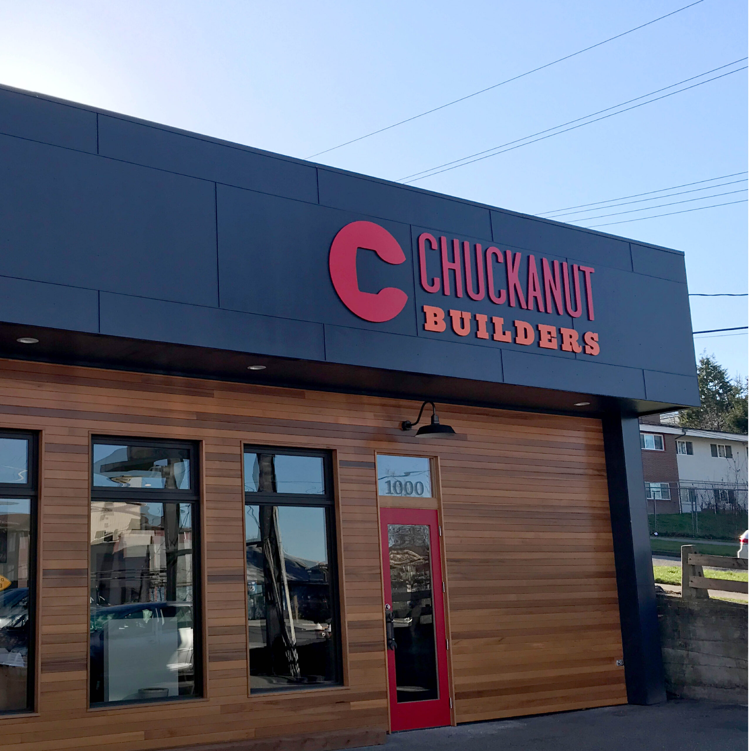
The color palette for Chuckanut Builders was inspired by the client’s affinity for safety orange — a color with immediate presence and a strong connection to the construction industry. We paired it with a deep, bold red and grounding black to create a system that feels powerful without becoming chaotic.
This combination was chosen with real-world application in mind. On job site signage, these colors demand attention. In digital and print contexts, they project confidence and clarity. The palette’s boldness also complements the clean, structured typography — each element giving the other room to perform.
bold type for bold work
The typefaces chosen for Chuckanut Builders draw direct inspiration from the tradition of wood type — letterforms that have long been associated with strength, craft, and physical presence. This was a deliberate nod to the client’s work with reclaimed wood and their deep respect for materials and process. The result is typography that feels at home in a construction context without sacrificing readability or polish. Bold strokes and clean structures make every headline easy to read at a distance, while reinforcing the brand’s overall character: capable, grounded, and built to endure.
Jenny Rae
Communications Manager
Chuckanut Builders
The insight, creativity, and depth of knowledge about branding and marketing that Shew Design provided to Chuckanut Builders was amazing and beyond our initial expectations. The entire process was highly-collaborative and educational. We left armed with a better understanding of our own business and processes as well as tools to improve customer communications.