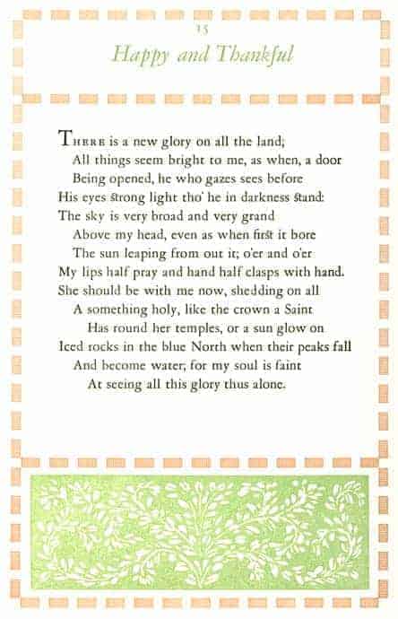
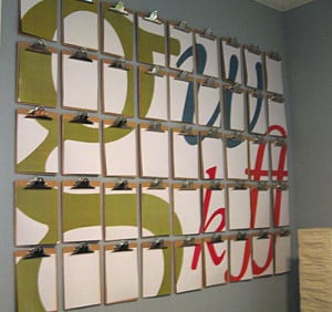
Garamond is one of a handful of typefaces that designers of all eras return to again and again.
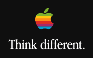
Apple used the condensed form in the late eighties, and it became the quintessential typographic solution for business communications in the early nineties.
People who make lists of the most readable fonts tend to pick Garamond first. It is ideally suited for book design. The Harry Potter books were set in Adobe Garamond, as are The Hunger Games books – even Dr. Seuss. It is also a staple for technical documentation for high end technology firms (like Nvidea).
It’s a remarkable thing that a 500 year old design would be perpetually connected with innovation and fresh, modern storytelling. The reason is at heart very simple: Garamond is a masterpiece of form and function. It works. Seen from distance or up close, it is simply beautiful *and* functional.
Designers categorize Garamond as a humanist typeface, meaning that it comes from a human (i.e. handwriting). Upon inspection, you can see how the forms were created by a brush with a wedge tip by a right handed person. If type is like an illustration, what does the quality of line reveal about the person who made it? To my mind, Garamond reveals a combination of intelligence, warmth, and mastery of control. It reminds me of Bach’s music – particularly such things as the Brandenburg Concertos or the Goldberg Variations.
Yet, there are ways in which the type departs from its humanist origins. In translating handwriting to movable types, type design began to evolve from being about ink to being about metal. In the example above, Jenson – which predates Garamond by only a few decades – is more closely linked with handwriting. In comparison, Garamond seems sturdier, more in alignment with a horizontal and vertical grid. This is the reason why Garamond (and not Jenson) is fresh and relevant today and will remain so for years to come. It’s also the reason we are not the only designers who have written an open love letter to Garamond. It is merely a first step in an evolution of type that would unfold for centuries to come – with successive type designers each attempting to reconcile an organic flowing motion of handwriting within an outlying grid.


