Replace or repair?
First, do no harm. In many cases, it makes sense to modify rather than replace a logo design. A logo modification can
- correct issues that are not working in the existing logo while preserving its essential qualities and ideas
- make the logo a better fit for specific uses (for example social media, video, etc.)
- modernize the logo by using updated colors or type
- sidestep the involved discussion and soul-searching that sometimes comes with a logo overhaul
- cost significantly less
![]()
simplify, simplify
If you do a visual Google search on “logo evolution,” you will see that a revision process is almost always a simplification process. The sense is often that the extraneous details progressively fall away until nothing but the essence remains. For modern eyes, the process looks smooth and inevitable. Knowing which details to keep is not always simple, however.
overhaul vs. revision
And of course, not all logos are salvageable. If you have a logo that doesn’t really communicate an idea, then a simplification process will reveal that there’s nothing really there. Part of being an experienced designer is understanding at a gut level what the options are early in the process.
Here are some examples of some logo simplifications we’ve completed in recent years:
2020 Engineering
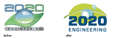
why we did it
- simpler, easier to use at smaller sizes and in a variety of applications
- stronger integration with collateral materials and website
- type and color were more readable and fit with other divisions within 2020
See this post for more information about how this logo was part of a family of other logos.
Greenways
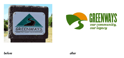
why we did it
- the logo needed to include a message of legacy and sustainability because it was going to be used in a political campaign)
- the redesign created a stronger integration with collateral materials and website
CAZ Energy Services and CAZ Environmental
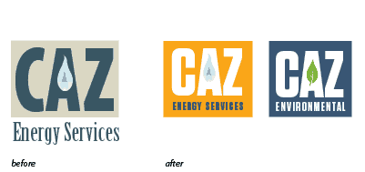
why we did it
- updated type treatment made it look more modern and fresh without creating confusion of original look
- integrated type allowed logo typography and web and collateral materials to fit with one another
See this post for more information about how this logo was part of a family of other logos.
DVSAS
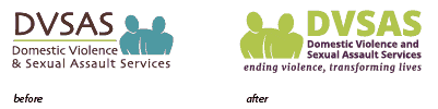
why we did it
- updated type treatment made it look more modern and fresh without creating confusion of original look
- integrated type allowed logo typography and web and collateral materials to fit with one another
- new typography was a closer match to the illustration in terms of color, weight and quality of line
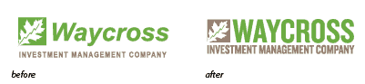
Waycross Investment Management Company
why we did it
- updated type treatment made it look more modern and fresh without creating confusion of original look
- integrated type allowed logo typography and web and collateral materials to fit with one another
- tighter visual alignment creates a stronger relationship between the imagery and the name
- changing the color of the line in the leaf logo made the hidden meaning of that symbol more easily understandable
Next steps
If you think your logo is in need of a little attention, you’re probably right. If so, drop us a line and we will help you out!


