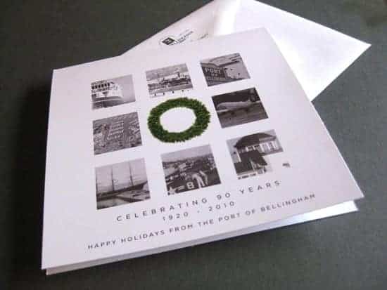
A holiday card commissioned by the Port of Bellingham became a little object lesson in design. The assignment was simple enough: use a series of historical photos to convey a message of holiday wishes without using symbolism related to any one religious tradition. In a sense, creating cohesion.
The tricky thing about the project was that there was no clear relationship between the source material and the holiday. The photos were all shot under widely different circumstances during the larger part of a century. In my previous post, I had mentioned how some jobs require a designer to play a secondary role of interpreting but not interfering with the source material. Here the opposite stance was required. The design process would be imposing meaning and coherence on essentially a series of unrelated photos, and then linking those things with something completely separate (the holiday).
After trying a variety of concepts for internal review, I felt that we were approaching a solution. We would impose a universal treatment on the photos – converting all of them to black and white and placing them in identical squares. A wreath would be set in and (of course) be circular, positioned in the exact center of a square layout. This concept uses visual contrast to transform the lack of relationship between the photos and the seasonal message a from a liability to a strength.

Lastly, the design was robust in terms of the revision process, easily allowing for photos to be added, removed or re-cropped to subtly change the message of the card. After one round of revisions, the card design was approved and delivered, and we were ready to start on the next project!