web databases

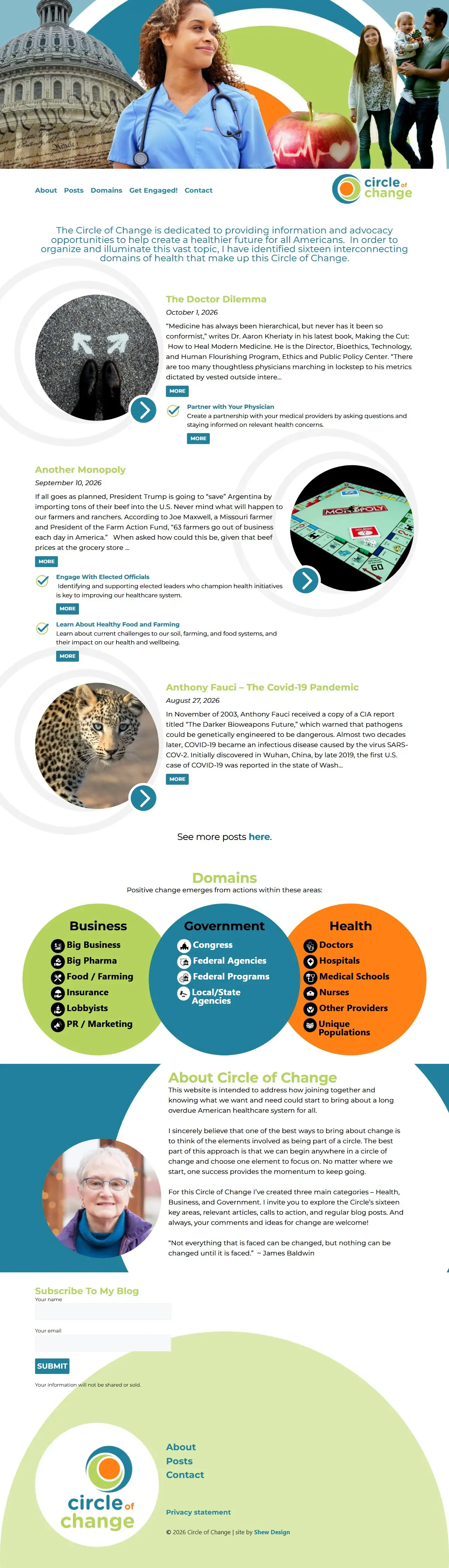
Circle of Change is built on connected content, not pages. Read how we organized it around actions instead of problems, and why a database-driven website starts with the data.
The biggest challenge for the Circle of Change website was organizing a large amount of complex content in a way that felt clear and approachable. Our solution was to design a structure where information, actions, and stories flow together seamlessly. This approach not only gives users an intuitive way to explore issues such as Big Pharma, but also connects databases so new content automatically appears in the right sections. The result is a site that looks polished, functions efficiently, and is easy to maintain over time.
sixteen domains in three circles
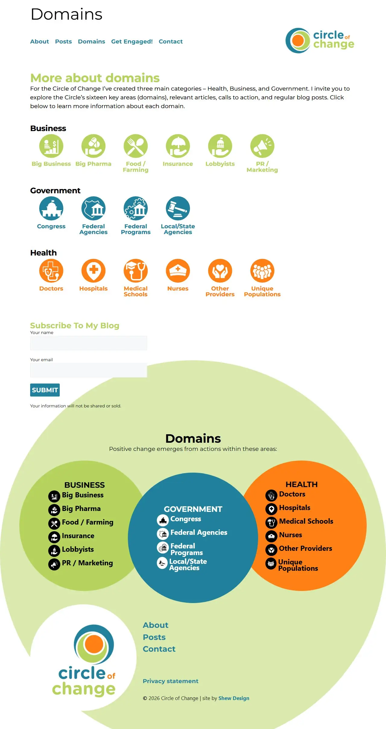
Healthcare is shaped by business, government, and the people who provide care. The site sorts that system into sixteen domains across those three categories, each with its own icon and category color. Visitors can start from any domain, from Big Pharma to Nurses, and find the articles and actions connected to it.

every domain is a hub
Each domain page opens with a plain-language definition, then gathers every article tied to that domain, newest first, along with the actions that address it. The Big Business page pulls in eighteen posts going back to 2019, and none of them had to be placed there by hand.
A large amount of complex content is organized in a way that feels clear and approachable.
from reading to doing
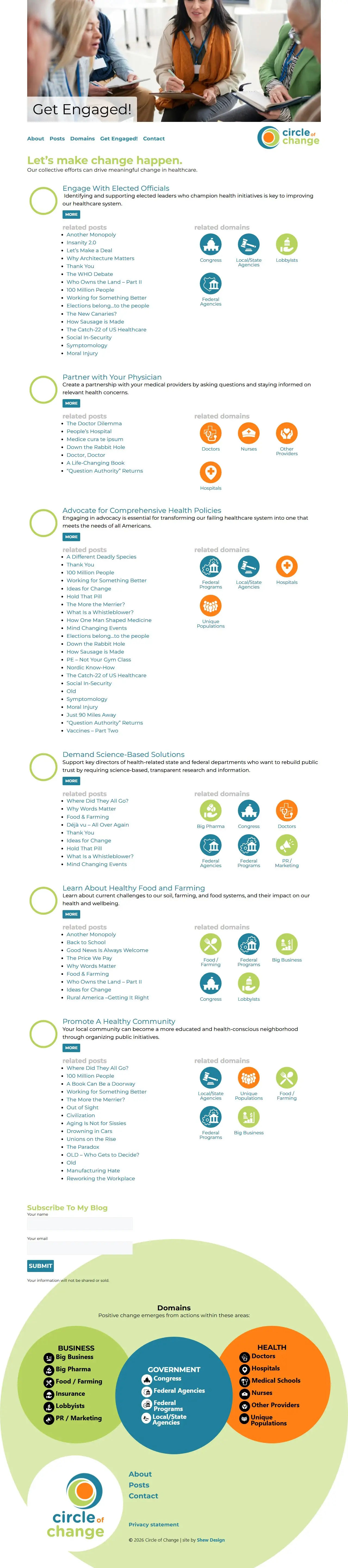
The Get Engaged page turns the issues into six concrete actions, like Partner with Your Physician and Learn About Healthy Food and Farming. Each action lists its related posts and the domains it touches, so readers can move from understanding a problem to doing something about it.
a robust, adaptable icon library
Drawn as one family, they take on the color of their category: green for Business, blue for Government, and orange for Health. The icons appear on the domains page, at the top of each domain page, beside every related action, and in the circle diagram at the foot of the site, so visitors learn to recognize each area at a glance.

Posts
Nearly 140 articles going back to 2019, from investigations like Another Monopoly to reflections like The Doctor Dilemma. Each post is linked to the domains it covers and the actions it supports, so new writing appears on the home page, on every related domain and action page, and in the archive the moment it is published, and readers can subscribe to get each one by email.
Bright, bold, and built to act
With sixteen areas of the healthcare system represented on the site, color helps readers orient themselves and move between sections without feeling lost. We chose three colors to represent the three categories. Green and blue are pleasing together, while orange works to direct users to buttons and other important info.
website features
We used a database structure to organize a large amount of complex content and display it to the user in a way that felt clear and approachable. Information, actions, and stories are tied together so they automatically display in the appropriate areas of the site.
Google Analytics installed for tracking site traffic, sources, user behavior, and additional statistics.
Key concepts and procedures explained in step-by-step processes through online documentation.
Additional security enhancements that protect the site from being hacked through brute force attacks, use of weak passwords, out-of-date plugins, and similar vulnerabilities.
Works on every sized device from mobile phones to desktop machines with larger monitors.