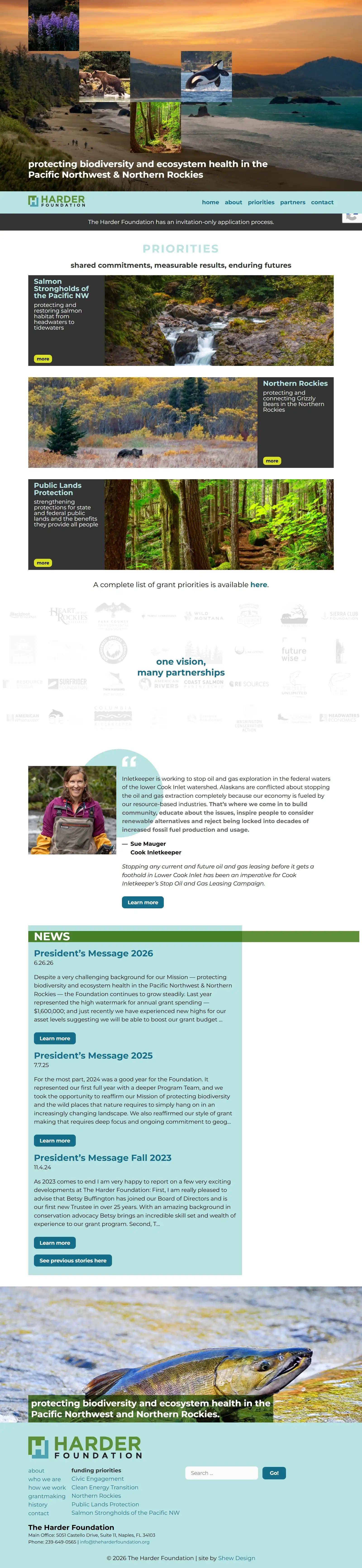
The Harder Foundation runs an invitation-only process and doesn’t solicit applications. What they need is a site that lets people see who they work with, the kind of environmental work they fund, and the scale of that impact in real numbers. Displaying a comprehensive tabulation of grants for every priority by year on the site is important for the Foundation. The database we designed for their site made entering annual award numbers as easy as filling out a form.
A redesign this visible was a real leap for an organization used to keeping a lower profile.
The redesign also made priorities the main event: strong photography and a clear visual hierarchy, so the partners and impact numbers do the talking instead of dense text. A redesign this visible was a real leap for an organization used to keeping a lower profile — but the new site gives the Harder Foundation a home that finally matches the weight of the work.

Staff
Every team member profiled with title, department, and a short bio — pulled from a single custom post type so editors can add or retire staff without touching code. New hires appear across the site (team page, program pages, event hosts) the moment they're published.
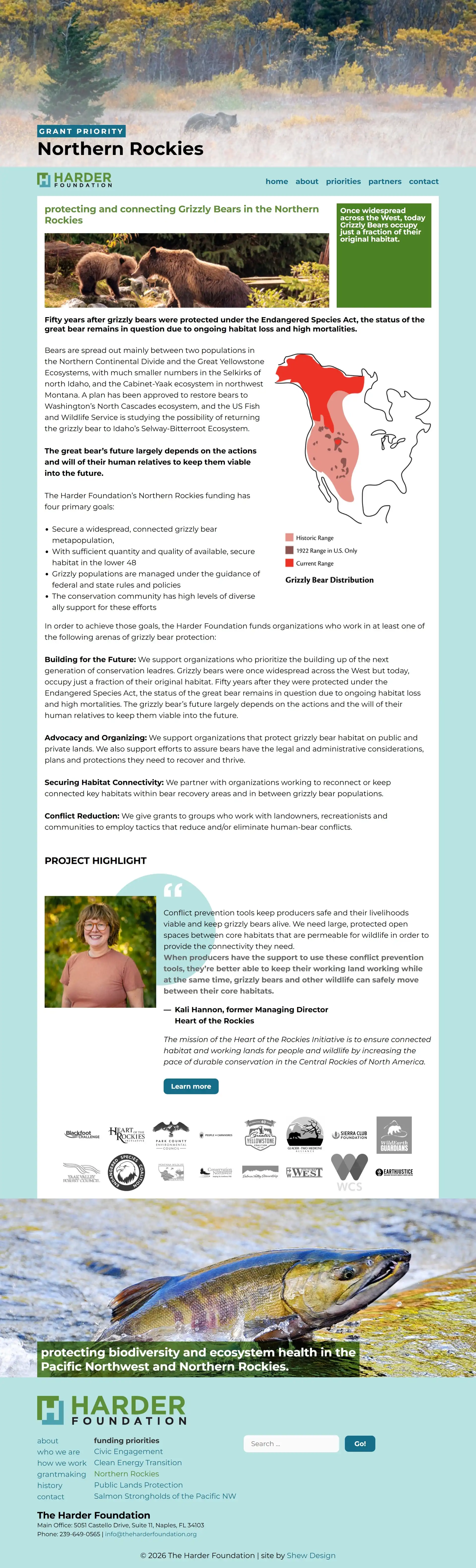
grant priorities are key to the site
Each grant priority acts as an organizing hub rather than a standalone page — a plain-language statement of focus (like grizzly connectivity in the Northern Rockies) that then threads through to the program descriptions, funded partners, staff contacts, and events tied to that work. It’s less a topic and more a lens the whole site is filtered through.
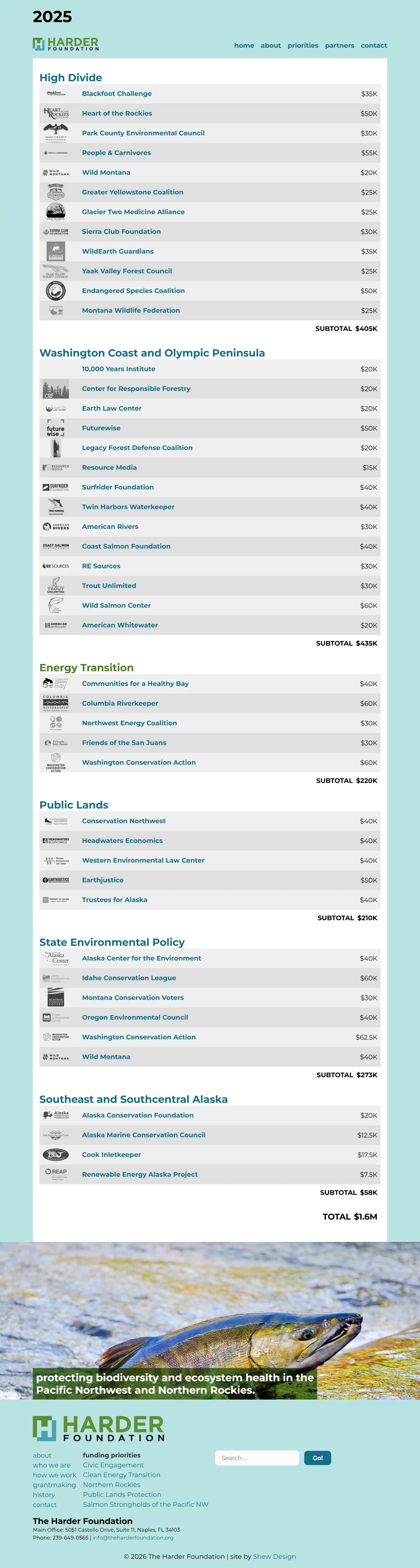
grant funding organized by year
A comprehensive tabulation of grants for every priority is listed both by year and total amount to date.
colors rooted in place
The Harder Foundation’s palette draws from the landscapes it works to protect. Deep forest green and blues anchor the brand, evoking old-growth canopy and cold, clear water. Color supports clarity here rather than competing with content – a deliberate choice for an organization whose work depends on communicating complex, interconnected outcomes to a broad audience of conservation partners and stakeholders.
website features
Key concepts and procedures explained in step-by-step processes through online documentation.
Interactive forms that send submissions to an email address or to a secure online database installed and configured.
Additional security enhancements that protect the site from being hacked through brute force attacks, use of weak passwords, out-of-date plugins, and similar vulnerabilities.