

a versatile, simple system
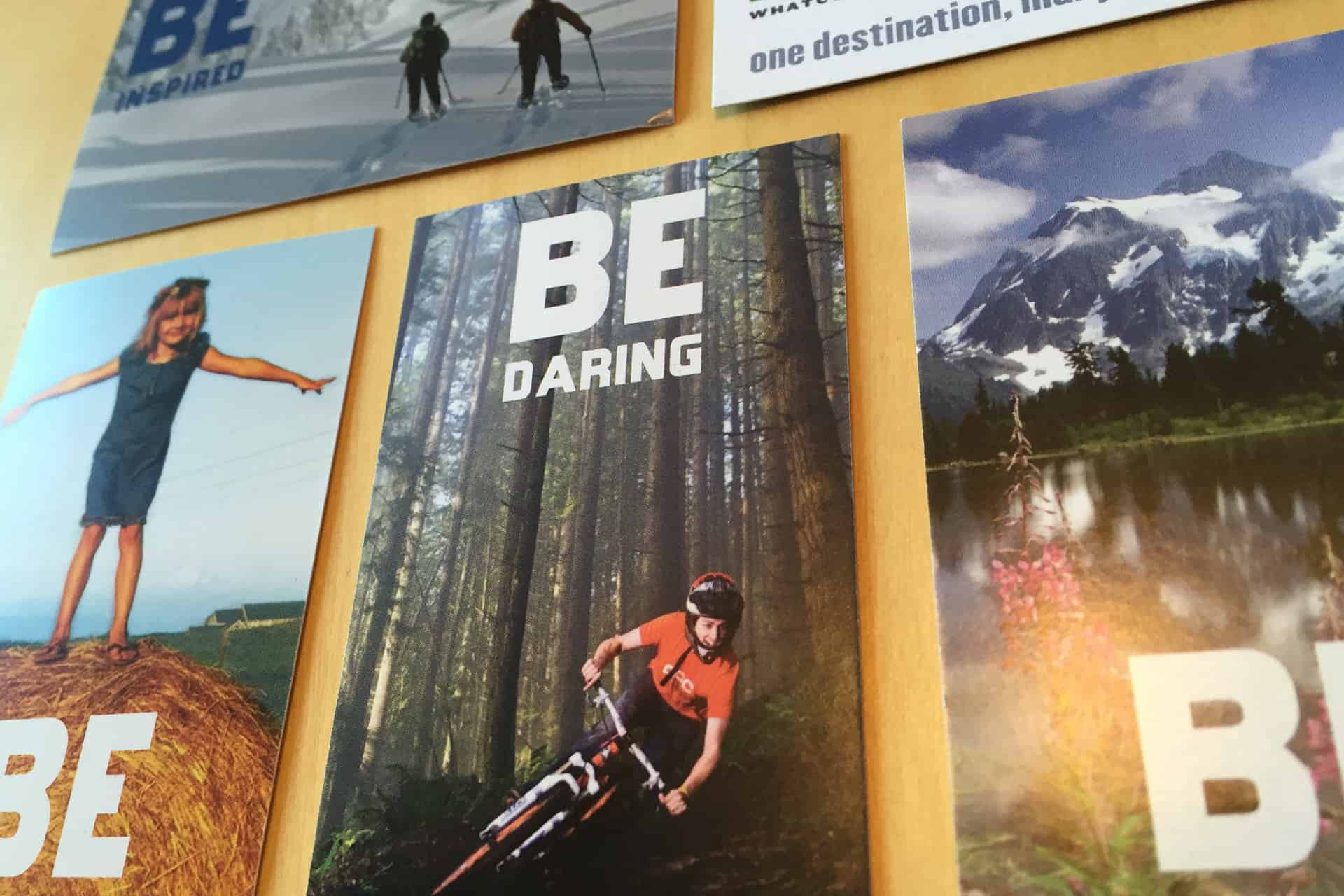
We created a variety of marketing assets that allowed for a versatile, simple system that is compatible with signage, print ads, and identity applications. This flexibility allows the brand to grow and evolve as new demands are placed upon it.
BE in Bellingham
Focusing on one feature alone would misrepresent the diversity of options in Whatcom County, so we opted instead to focus on the audience, using language that speaks to the interior experience instead of external circumstances. This decision led to an open-ended approach to messaging, allowing for a library of photographs and phrases (“BE daring,” “BE in awe,” etc.) to be used in a wide variety of applications, each culminating in the directive to “BE in Bellingham.”
Let’s go!
The following booklets were designed to be a user friendly and visually appealing invitation to visit Mt. Baker. We promoted hikes for the summer months and playing in the snow for winter months. The smaller booklet size made it possible to use full-page photos for each destination on one side of the spread, and a key of information and a text description for each activity on the other side. This consistent layout makes it easy to thumb through and compare activities in terms of difficulty and time required.
color as compass
Color plays a central role in how a destination communicates its character before a single word is read. For Bellingham Whatcom County Tourism, we developed a palette rooted in the natural environment that defines the region — the deep blues of Puget Sound and Bellingham Bay, the rich greens of old-growth forests and farmland, and the warm, earthy tones that echo the area’s rugged coastline and mountain terrain.
Across national and regional campaign materials — from digital advertising to printed collateral — the colors needed to remain bold and recognizable at any scale, in any context. A strong, cohesive palette ensures that every touchpoint, no matter where it appears, is immediately and unmistakably Whatcom County.
letters that invite
The typography for Bellingham Whatcom County Tourism was selected to reflect the region’s distinct personality — a place where rugged natural beauty meets a vibrant, cultivated community. The primary typeface carries a sense of quiet confidence, with clean lines that feel modern without being cold, grounded without being stiff. It communicates a destination that takes itself seriously but never loses its warmth. Secondary type choices bring balance and versatility, supporting everything from bold campaign headlines to the finer details of wayfinding and print collateral.