Event graphics and messaging are great opportunities for organizations to capture interest by exploring different ideas and flavors in their communication. Shew Design takes a branded approach to event graphics, creating a few simple elements that can be easily repeated in any number of other materials. We think of this as our toolkit, with the goal being to use some combination of the tools in all of the deliverables related to a given project.
Even a simple campaign benefits from this approach. Here is a poster we recently designed for Pickford’s unofficial Oscar event.
Our “toolkit” is comprised of
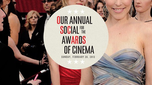
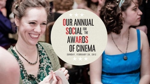
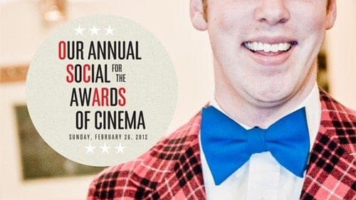
- a simple typeface treatment enclosed in a circle,
- a halftone filter very subtly applied to photos to give it a slight newsprint quality
- a cropping concept of only including portion of the face (this last concept was inspired by the camera work in Rosemary’s Baby, which torments you by hiding critical details from view)
These elements were later used to create a series of screen ads, a few of which are shown here.
By making simple choices, the resulting system plays well with others – in this case Mark Michael French’s excellent photography.
Striking images of local people having a great time, playing with the concept of Oscar in a tongue and cheek way is a far better emotional draw than any logo or type concept. The best design strategy, therefore, is one that supports – instead of interferes with – the story told by the photography.
In this way, consistent use of a few simple elements allowed us to quickly create additional designs that were instantly recognizable as being part of the same event. Additional materials could be easily made that would follow these simple rules. Try taking this approach – simpler is better – for your next event. The ability to include both variety and consistency in designs should satisfy any team, from large to small.


