Hidden messages, conveyed through optical illusions, puns, subliminal messages, riddles, and in jokes, have always played a unique role in visual communications. They raise questions that are fun to ask, but often impossible to answer. More than anything, they appeal to a childlike delight we all share in finding in things ‘hidden in plain sight.’
I’ve read that Amazon CEO Jeff Bezos remarked “whoever doesn’t like this, hates puppies” when discussing the Amazon logo. The double meaning of the arrow and smile is brilliant.
The FedEx logo contains an arrow in the “Ex.”
This inspired us to develop a hidden message in the the Interfaith Community Health Clinic logo, as a visual pun combining healthcare (symbolized by the cross) and a community.
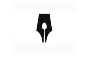
The Guild of Food Writers is a visual pun combining a pen nib and a spoon. The interaction of positive and negative space creates many opportunities for using one image to combine multiple symbols.
The Toblerone logo contains a bear.

Though its an open question if this image actually contains hidden messages, beyond a doubt the discussion makes the logo more interesting.

Whatever the album’s creators intended, the messages woven into this piece add enormously to its memorability.
In the design world, adding a “hidden message” is a great way to subtly reinforce a message without adding clutter, and also a great way to reward viewers when they “get it”.


