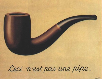
I had coffee with a friend this week who asked me for my thoughts on a brochure draft. The purpose of the brochure was to encourage people to donate to an organization that protects communities from a mechanical failure that can result in enormous harm and loss of life.
The writing was straightforward enough, but the graphics struck me as odd. A picture of an explosion filled the entire front panel. Below it, a logo highlighted the word “trust” featuring a symbolic depiction of the faulty equipment in fire engine red. This pattern was repeated throughout the entire piece.
I told my friend that I thought the piece was crazy, literally. Where the verbal message was about creating confidence and security, the graphic message was about the exact opposite. The result was a brochure that was difficult to understand or believe in. It was fundamentally compromised as a fund raising tool.
My advice was to frame the piece within one message, and to make the graphics and words support one another so that the resulting piece could be easily understood by the audience. Instead of the explosion overwhelming the entire panel, it could be framed – contained as it were – by text describing the organization’s purpose.
Creating consistency between the verbal and visual parts of a message is a great rule of thumb. If more people used it, it would keep a lot of bad marketing safely out of sight. Obvious culprits include things like the aforementioned images of disaster to sell safety or peace of mind, or stereotypes of used car salespeople or criminals to sell the importance of trust or reliability.
The exceptions to this rule are many, often necessary, and occasionally brilliant. It sometimes makes sense to show overweight people to sell the importance of exercise, for example, or a deforested landscape to talk about the importance of ecology.
And sometimes saying one thing and showing another is effective marketing, particularly in political messaging through words like “peace keeper” or 1984’s “Ministry of Love” which was essentially an instrument of torture. It’s a bizarre human truth that you could stick the name of something onto its opposite without raising eyebrows. Here in Bellingham, Washington, the “People for Progressive Transportation” are essentially arguing for dismantling a bus system in favor of cars. Such is the power of names.
My recommendation is to be mindful of the distance between words and the visuals that accompany them. Make sure they match one another unless you have a specific reason for doing the opposite. If you are promoting a solution to the problem – especially an abstract problem – be especially careful about depicting the problem. Consider “containing” the problem so that the problems and solutions never comingle and become one in the minds of your audience.