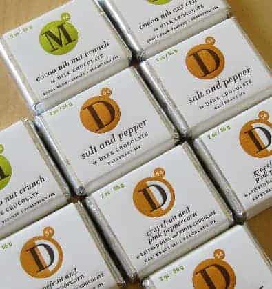
Research plays a crucial part of creating good design, and so a designer’s life is essentially a never ending series of opportunities to learn. The best designers are really the best at learning.

That’s what I like to say as I help myself to a generous handful of research. My third. “That’s Callebaut, 54%,” Kevin informs me, and you know, that actually means something to me. It’s taken a while.
Becca and I have been talking with Kevin Buck from Chocolate Necessities about chocolate – the business of chocolate, the artistry of chocolate – for about three years now. What began as a series of sales meetings has since evolved into a series of friendly conversations about business and creativity over beer. And chocolate.
And what chocolate it has been. Chocolate so vast and dark it swallows you as you swallow it. “That was good,” you somehow say after emerging from the experience. Bright chocolate that seems as endlessly clear as a blue sky, a tuning fork in your mouth that goes and goes and goes. Chocolate covering these amazing candied lemon peels that can only be found from a specialty vendor in France. Chocolate with almonds that have been precisely chopped to an exact size. Chocolate with course black pepper. Chocolate in gelato. Chocolate with beer. Chocolate covering chocolate, dipped in chocolate.
Yes, this is research. For a creative strategy for talking about chocolate, and educating people about it in packaging, advertising, and the web. That education began with us looking seriously at our client, his values, products, and market.
First, we saw that Kevin was the real deal – a relentless force for improving through experimentation, curating and stockpiling rare and specialty ingredients, and endless research. Endless. Contributing to this perception was the gradual realization that the chocolate industry – by and large – cuts major corners and delivers a fundamentally compromised product. I knew Hershey’s was “a certain way” entering the process, but soon major high end, artisan, manufacturers fell under the same shadow.
Having this new understanding of how our client’s product fit in with the chocolate marketplace, we evaluated the universe of wrappers with a critical eye. There is no shortage of great work out there, brilliant and beautiful. But a beautiful design that covers a compromised product is the exact opposite of what Chocolate Necessities is all about. Though individual wrappers were often great, the marketplace collectively looked increasingly over designed. We had to find a new way.
First things first. We looked at the product – only a few high quality ingredients. Nothing extra. The design concept should have the same qualities. And with a romantic flavor predominating in most competitor’s designs, we opted for a more classical approach. We landed on Bodoni and Futura – two type families at home in the Italian tradition of high end chocolate and confectionery – and married that idea to the periodic table with the thought that this conceit would expand and adapt as it was incorporated into other products. This is, after all, a visual language about chocolate.

In terms of production, we opted for letterpress printing on Mohawk Superfine paper stock, a high end, soft, dense paper that would beautifully accentuate the three dimensional impression of the plate. Letterpress production meant only a few colors could be used, but each would be distinctive.
The copy was also ultra minimalist – including just a description of the contents in as few words as possible. No pronouncements about “the finest ingredients”, as these claims are broken through overuse. Quality is communicated through production and design and the product delivers on that promise.
Though this is a modest product in terms of its reach, we are proud of it. It emerged out of a collaborative, trusting partnership with the client that grew from years of discussions. Had we not learned from these interactions, I think we would have been yet another design company making something that “stands out.” Instead, we created a simple concept that was in better alignment with the product and with the strategy of building an ever larger base of returning customers and believers. To those I offer this message: welcome to the club and enjoy the chocolate.
Comments are closed.