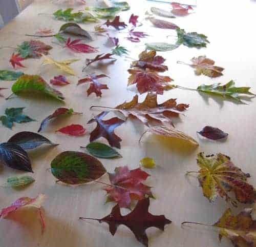
The combination of new location, a daily bike commute, and quick daily walks have made Becca and I much more sensitive to the changing seasons this year. Readers of previous posts will remember that leaves are of particular interest to us this fall.
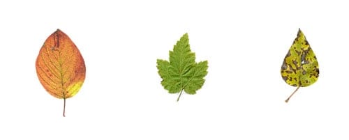
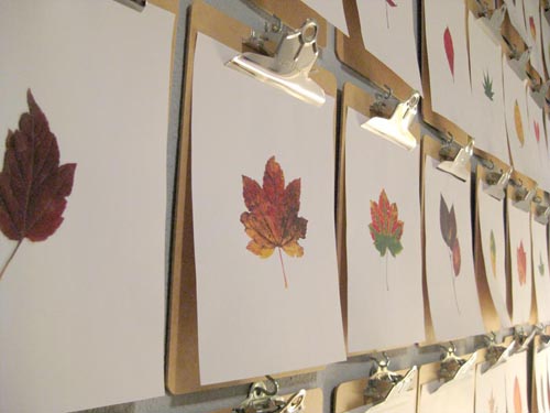
We were especially struck with the incredible richness and range of colors, and Becca had a great idea to use them in our office entry room signage. The concept was to isolate each leaf against a perfectly white background.

Although completely natural, the project had the feeling of a design exercise – with the different size, shape, and patterns of each – creating a sense of both diversity and unity that makes the natural world endlessly fascinating. It reminded me of the evolution of typography, how the interplay of form and function propelled countless designers to reinterpret the same essential forms, over and over again.

Most striking is that the leaves were all gathered within a few blocks of our office. In an urban setting of concrete and cars, it is easy to think of the natural world as something “out there.” Yet, the diversity of these leaves tells another story; we have only to open our eyes and see.

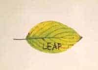
A call out to the person who wrote down “leaf” with a felt pen on a leaf at Maritime Park. Somehow, among the millions – perhaps billions of leaves – we found your message and included it in our project. What are the odds?
