I thought The Devil Wears Prada had a wonderful insight into the culture of design and the mindset of designers. You may be able tell at a glance that I am somewhat a stranger to fashion, but there was much of this movie I could relate to – none more so than the scene above.
I think the reason I could so easily relate is I feel that, fairly late in life, I made the transition from being like the Anne Hathaway character to being like the Meryl Streep character. I can see this scene from both character’s point of view.
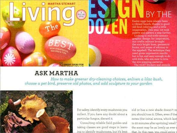
Here’s a design / branding version of the Meryl Streep’s cerulean sweater, and it comes from another “devil” of sorts: Martha Stewart. In just over ten years, a distinctive type family linked with her personal brand went from iconic status to something nearly despised by some as the “next Papyrus.” Here is how this played out.

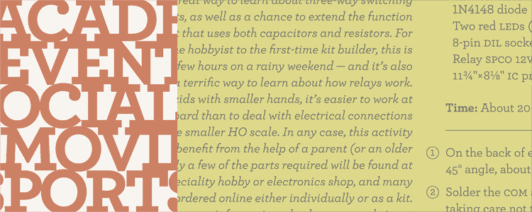
Archer is what’s known as a slab serif, a type of typography that is industrial in a graceless masculine way. It would be at home in 50s and 40s boy scout manuals, US army paperwork, electronics kits, and hardware catalogs. I speak in generalities because there are many exceptions. Hoefler and Frere-Jones rethought the concept of a slab serif, preserving the sturdiness of it but adding an element of grace. From a type nerd point of view, it was like something totally new under the sun, a brilliant reconciling of two opposites: boiling, frozen water. This was in 2000. The font was Archer, the client was Martha Stewart Living magazine.

And it suited her to a T. The typeface was a masterpiece – versatile, beautiful, tough as nails, smart, smart, relentlessly smart – just like Martha. And (so far as I could see) possessed by her and her alone. It was used brilliantly, and part of that brilliance was that it was invisible to all but a few. You’ve doubtless heard of Martha, but this is probably the first you’ve heard about her typography – yet it continues to be a powerful presence in her brand. Archer is her font.
I coveted it and searched for it for years until I stumbled on an announcement of its release as a “new” font from H&FJ. Later, I figured it out that type families are commissioned for private use and then often later become available to the public. That was in 2007. There were seven years between Martha’s use of this font and it’s public release.
You can surely guess the rest of the story. Now Archer is everywhere and designers of a certain type are starting to roll their collective eyes in horror of it all. I guess they’re right. Archer has become the go to font that buttoned up organizations are using to create a home crafted, earnest, but still sophisticated voice. Once this goes stale, they will move onto the next thing. But for now, the devil wears archer.
The next level down: Newsweek in 2010
I look forward to that cycle – including the inevitable backlash among the designers – finishing soon. This type family can then enter into a cultural equilibrium, joining the pantheon of wonderful, time honored type families that designers use (and use sparingly) for years to come. This will only happen in the distant, distant future when all recent goings on have long faded from memory. Say 2016.
