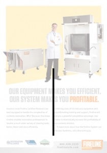
Thinking about structure in your marketing materials is about how you decide to use visual relationships to reinforce your message. It means thinking beyond what is being said, and exploring the how.
As always, the process begins with focusing on your message, ideally your one message. Deciding on a core message is often the biggest challenge, especially if multiple decision makers are involved. However, once you have it, the rest is, in a sense, “just details.”

In the ad above, profitability is the key message; the function of the ad is to help the audience trust the company and the product it sells. Conveying trust is a task well suited to structural thinking, as is evidenced by the language of trust (e.g. “a solid partnership,” “an upright citizen,” “a stand-up guy,” a “shaky deal”).

I think it’s easier to trust something that’s perfectly centered and perfectly straight, than a crooked something that leans one way or another. That was the reason behind conceiving the middle as a backbone for this ad. It connects the perfect vertical of the man’s weight bearing leg with the copywriting and the frame holding the various logos. I think of these organizational elements as power lines (like power chords), combining the function of support beams, taut string, and a live wire. Not using them at all creates visual oatmeal, using too many is like a pile of glass shards. A handful is just right.

Color provides another critical point of connectivity, in this case linking the message with the logo – a relationship reinforced by both elements using the same type set at the same size. Visually, we are prompting the audience to associate profitability with the Fireline brand. Conveying this message verbally and visually makes it more interesting and believable.

A final structural component is the consistent use of spacing between the various elements – depicted above through the lines and squares of equal length. Building consistency into a design in this fashion subtly communicates a methodical, professional reliability into the message, but I think the real purpose is to be invisible. We don’t want waste the audience’s attention on these details. Their function is always to support – never compete with- the primary message.
I’ve found that thinking structurally about design has helped us convey messages relating to corporate success, trust, reliability, and strength. Building credibility. However, there are times when a too structured approach ruins a concept by slowly draining the life out of it. The middle ground between too much chaos or order is different for every project or person. As always, the best strategy is to understand how the choices you are making figure into the final product.