Recently, towards the end of a branding phase for a client, we were finalizing page designs for their website. The site was essentially a reproduction of the paper materials. While they liked the design on paper, the same design on screen felt cool to the touch – overly so. We agreed with their perception.
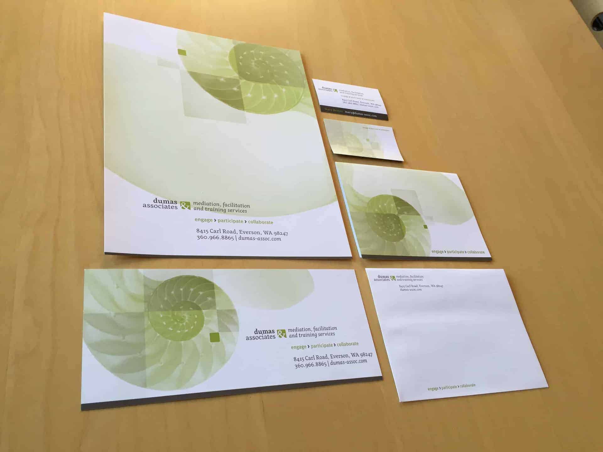
Adding warmer colors to the design would break the brand concept. Not optimal. Instead, we applied a very light branded green to the background. This slight, almost imperceptible change didn’t seem to break with the brand and made the end result that much warmer. Problem solved.

The cause of the issue lies in the nature of how print vs. screen. I think it’s the nature of reflected light, which is inherently richer and more complex than light emitted from screen, especially when reflected by an organic surface such as paper. Printed through high end production process on quality paper, the design that seemed crisp and inviting on print, seemed stark on screen.
The take away was for us to think about the subtle message carried by the background, and how creating a quality product is being sensitive to those details. More importantly, it is another example that observing the spirit of a thing is more important than observing it to the letter. In this case, we adjusted our pristine white paper brand concept to accommodate the realities of computer monitors. It was an exercise in brand consistency.
Just as an architect designs buildings to “breathe”, to respond to wind by swaying back and forth, or a carpenters builds furniture to accommodate how wood shrinks and grows with temperature, good branding is about building systems that flexibly (and usually invisibly) accommodate different circumstances without being breaking down.


