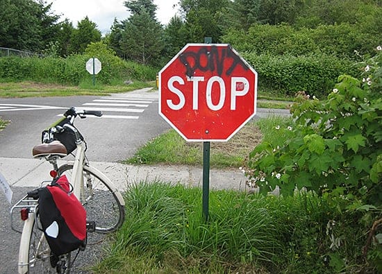
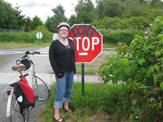
Eric and I started commuting to work on our bikes almost a year ago. Details that were normally overlooked were suddenly noticed and studied. This particular stop sign was one of them.
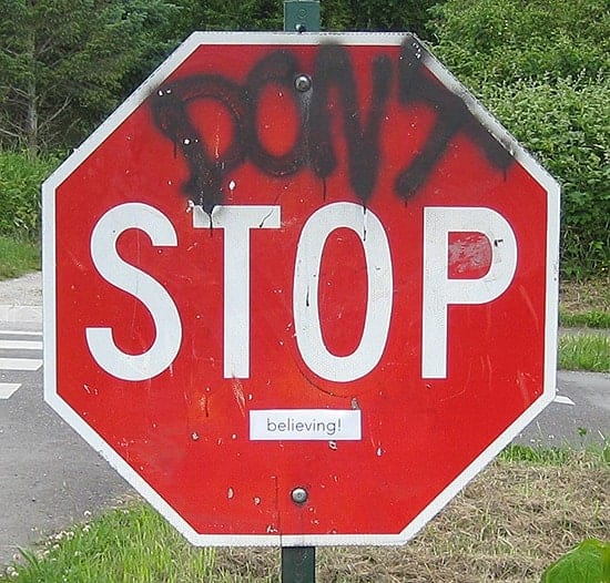
“Don’t” had been added to the sign, and at one point someone had handwritten “believing” below this. Later, for whatever reason, “believing” was removed, while “don’t” was left there. An ugly sign along a beautiful interurban trail.
As long as I can remember I was aware of my surroundings in an aesthetic way. My Dad is an architect, and my Mom has always had a hands on creative design sense. The first surroundings I can remember involved things like a handmade couch that was comprised of a simple large plank of wood sitting at toddler height with rectangular cushions sitting atop it. A clean white stylish pendant hanging lamp, that was designed and assembled by my Dad, who very patiently glued styrofoam cups together to form a perfect globe. The list goes on, but the thing these things had in common was that they were a very intentional way of making an environment just what they wanted it to be. It was not okay to settle for an inexpensive store bought overstuffed couch or standing lamp when what you wanted was so simple and elegant, yet perhaps slightly out of budget.
Growing up surrounded by this intentional environment had a powerful effect on me. The idea that you create the space you want to live in is one that I’ve carried into my adulthood in both a personal and professional way. I’ve frustrated Eric by not wanting to eat in a particular restaurant because they used tennis balls as cushioned feet for their chair legs. I’ve also delighted him with the colors and design of our office. There is a room to view our work, a room where we are creative, and a room for collaborative meetings. It was designed with intention. Being in this environment has a powerful affect on our creative work. It’s inspiring to work in a space that you love.
Our bike commute is also inspiring, and I didn’t want to keep biking past this sign with its ugly message.
I added one small word. Small enough that you have to get pretty close to read it. You have to pay attention to catch it. Yet it takes an ugly message and turns it into a positive one. I’m sure it’s not caught by most, but seeing a high school aged girl stopping to take a picture of it with her phone while her friends continued walking made me smile. A like minded person, perhaps.


