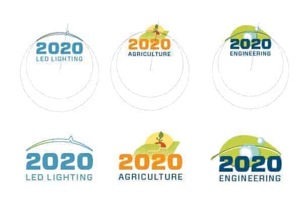
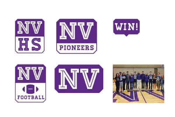
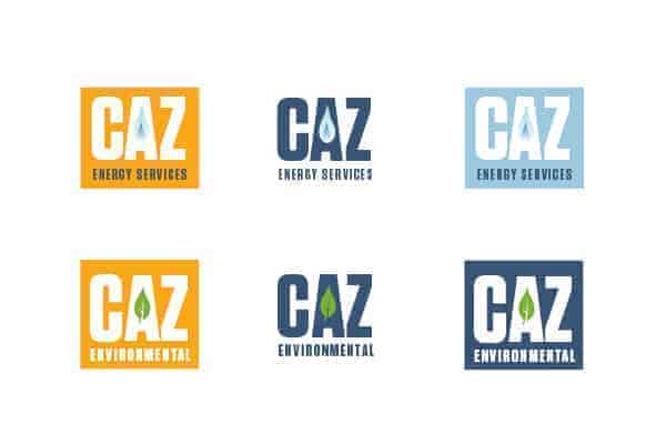
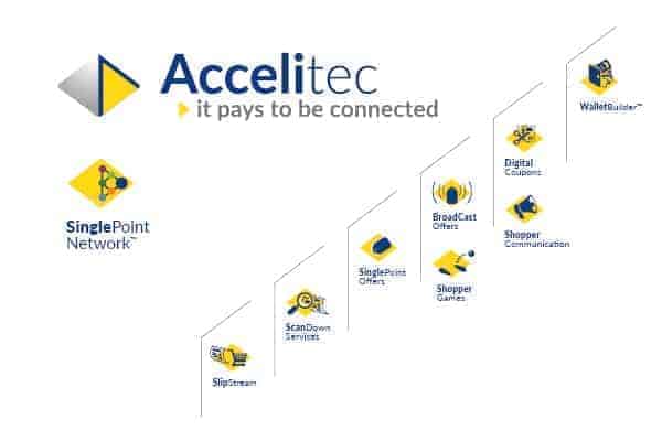
Families of logos and icons are powerful ways of connecting with clients and customers. Where a single logo communicates a single thing, a family of logos talks about similarities, differences, relationships, and choices. Families are about marketing systems and they can benefit your organization’s branding strategy.
Visually, a family of icons has one shared element that ties things together. This can be a shape, an angle, a color, or a typeface. Other aspects about an icon are different.
A logo family can be used to talk about
- product features.
- audiences
- product offerings
- related companies
- steps in a process
We like to create outcomes for our clients that allow them to independently accommodate changing circumstances in stride. A marketing toolkit comprised of key messages, assets such as icons or infographics, colors, and similar elements allow for wide range of approaches to fit within a larger branding strategy.
Even the logo can benefit from this dynamic approach. Typically, one logo is used by default, but others can also be used: one for horizontal applications, one for vertical, one with tag, one without. Having these assets readily available makes it a lot easier to effectively use your logo.
Families of logos open up doors to new ways of communicating to the audience, showing people that the products and services you offer are part of a thought out, strategic process.