websites for nonprofits have special opportunities and challenges
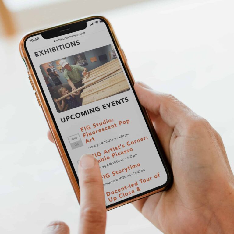
Your website is often the first place a potential donor or volunteer decides whether to trust you. Lead with your mission in plain language, then show the impact: real stories, real photos, and clear numbers.
A nonprofit’s website has a harder job than most. In one visit it may need to win over a first-time donor, help a volunteer sign up, reassure a foundation program officer and get someone in crisis the help they need. And it usually has to do all of that on a small budget with a team that’s already stretched.
The good news is that good nonprofit web design isn’t about flashy features. It comes down to clarity, trust and making the next step easy. Here are the practices that matter most, with examples from nonprofit sites we’ve designed.
In this post
- Say what you do, in plain words, right away
- Make giving easy
- Design for phones first
- Make accessibility part of the mission
- Tell stories, then back them with numbers
- Build trust everywhere
- Give every type of visitor a clear path
- Make it easy to update
- Connect your site to social media and your calendar
- Don’t overlook search and speed
- Measure what matters
1. Say what you do, in plain words, right away
Skagit Rising
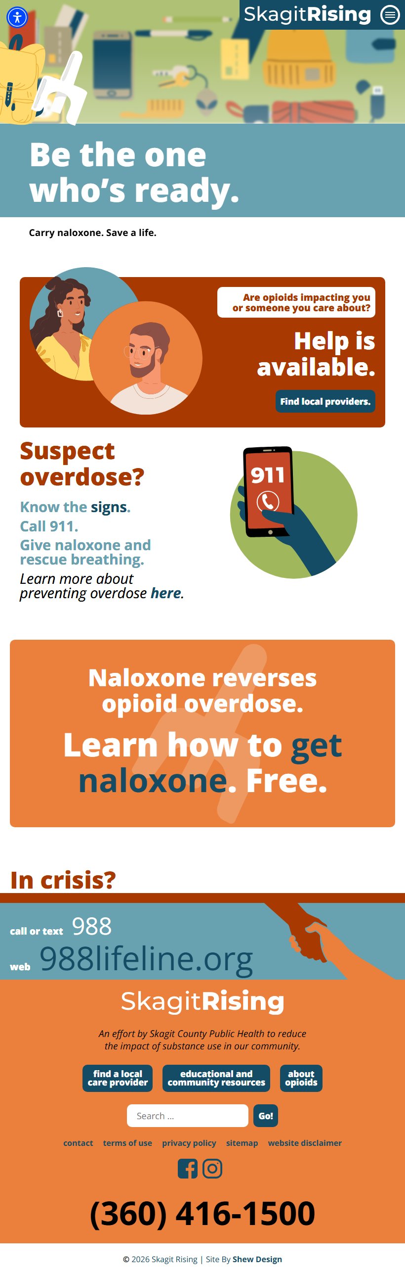
The Skagit Rising homepage leads with its most urgent message: what naloxone is and how to get it. Staff can swap in a new message and image whenever their priorities change.
Visitors decide within seconds whether they’re in the right place. Your homepage should answer three questions without anyone scrolling:
- Who do you serve?
- What do you do for them?
- How can I help?
Leave the jargon out. “We empower underserved communities through holistic capacity-building” tells a reader almost nothing. “We give free tutoring to kids in Whatcom County” tells them everything. Keep the full mission statement for your About page. Your homepage headline needs to be clear first and clever second.
From our work: Skagit Rising‘s directory lists more than 30 local treatment and recovery providers, each with services, insurance, hours, interpretation, and step-by-step instructions for how to connect. It’s sorted by type of care, and written in clear, easy to understand language.
2. Make giving easy
Your donation process is the most important path on your site, so treat it that way.
- Put a visible Donate button in the header on every page, in a color that stands out from the rest of your design.
- Keep the form short. Ask only for what you need to process the gift and send a receipt. Every extra field costs you donors.
- Keep donors on your site when you can. An embedded form feels more trustworthy than being sent to an unfamiliar third-party page.
- Offer suggested amounts tied to impact. “$50 provides a week of meals for a family” is more motivating than a blank box.
- Make monthly giving easy to choose. Recurring donors are among the most valuable supporters a nonprofit can have.
- Show a real thank-you after the gift: a message that confirms it went through and shows them what happens next.
3. Design for phones first
According to the M+R Benchmarks 2026 study, 52% of nonprofit website traffic now comes from mobile devices. But only 8% of mobile visitors who reach a donation page finish a gift, compared with 11% on desktop. For small nonprofits, mobile drops to 4%. That gap is the cost of a site that merely fits on a small screen instead of working well on one.
- Buttons and links should be large enough to tap easily.
- Text should be readable without pinching to zoom.
- Donation and volunteer forms should be fully tested on mobile, not just made to fit.
- Images should be compressed so pages load fast on cellular connections.
4. Make accessibility part of the mission
Mattawa Community Medical Clinic

The clinic serves a large Spanish-speaking community, so a one-click toggle shows the whole site in Spanish. Every page and document was translated by a person, not a machine.
For many nonprofits, accessibility is part of who you are, not just a compliance item. If your mission is about inclusion, equity or serving vulnerable groups, your website should reflect that.
Use the Web Content Accessibility Guidelines (WCAG 2.2, Level AA) as your benchmark. In practice, that means:
- Strong color contrast between text and background
- Alt text on meaningful images
- Headings used in order (H1, H2, H3) so screen readers can follow the page
- Every feature works with a keyboard, not just a mouse
- Captions on videos
- Form fields with clear labels, not just placeholder text that disappears
An accessible site is easier for everyone to use, including older supporters, people on slow connections and anyone reading in bright sunlight.
5. Tell stories, then back them with numbers
Whatcom Has Hope
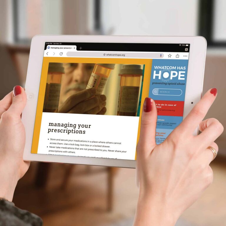
The home page uses the same real faces and messages as the campaign’s bus ads, so someone who saw a bus on the way to work recognizes it the moment they arrive.
People give to people, not to statistics. The most effective nonprofit sites lead with real stories: one student, one family, one rescued animal. Then they show the bigger picture.
- Use real photography of your work and community whenever you can. Stock photos are easy to spot and weaken trust.
- Pair each story with concrete outcomes: meals served, students graduated, acres protected.
- Always get permission and protect dignity. Tell stories with the people you serve, not about them.
From our work: Every page of the Neighborhood House site uses the organization’s own photography of real families, staff and neighbors instead of stock images, so the site feels grounded and personal from the first click.
6. Build trust everywhere
Donors want to know their money is in good hands. Help them feel confident:
- Publish annual reports and financials where they’re easy to find.
- Show your staff and board with real names and photos.
- Show any charity ratings or seals you’ve actually earned, such as from Charity Navigator or Candid.
- Include your EIN and nonprofit status on your donation page.
From our work: The Harder Foundation wanted people to see the scale of its impact in real numbers, so the site shows a full table of grants for every priority by year. We built a simple database behind it, so entering each year’s awards is as easy as filling out a form.
7. Give every type of visitor a clear path
World Puffin Congress

Researchers, teachers and conservationists each get their own way in. The resource library filters by format or topic, so a teacher looking for curricula and a scientist looking for papers both land in the right place.
Not everyone who visits is ready to donate. Design paths for each audience:
- Donors: Give, monthly giving, planned giving, corporate matching
- Volunteers: Open roles, time commitment, a simple sign-up
- People seeking services: Clear eligibility, contact information and next steps, ideally reachable from the homepage in one click
- Partners and funders: Impact reports, programs and a direct contact
Clear navigation labels like “Get Help,” “Volunteer” and “Give” work better than clever ones. If you’re not sure which labels people actually use, your analytics can tell you.
From our work: The World Puffin Congress site connects the scientists, artists, educators, and colony caretakers working on behalf of puffins around the world. Their website gathers that community in one place, linking each person to their research, artwork, and conservation work so visitors can learn about puffins, celebrate them, and help protect them.
8. Make it easy to update
Your website is only as good as its most recent update. Choose a platform your staff can actually manage, like a well-built WordPress site, so that routine changes don’t need a developer. A beautiful site that nobody can update will be out of date within a year. An events page that still shows last year’s gala quietly tells visitors no one is minding the store.
Build the things that change most often as structured, fill-in-the-blank content types rather than freeform pages, so updates stay consistent no matter who on your team makes them:
- Annual reports. Give each year its own spot in a simple archive, so publishing a new one is as easy as uploading a PDF. Funders and major donors look for these.
- Events. Each event gets its own page with the date, time, what to expect, registration, pricing, the full address, parking and accessibility details, and a map link. Past events should move to an archive automatically.
- Contact information and hours. Keep these in one place that updates everywhere on the site at once.
- Staff and board listings. People change roles, and an outdated team page undermines trust.
- Urgent announcements. A simple banner your team can turn on for closures, emergency needs or deadlines.
From our work: The Port Townsend Marine Science Center runs a full calendar of tide walks, lectures, cruises and camps. We gave each kind of program a template that holds everything that stays the same (ages, cost, location, directions, FAQs), so staff schedule an event by picking its template and setting the date. Since launch, the team has kept the site running through staff turnover, calling on us only for the occasional technical question.
9. Connect your site to social media and your calendar
Your website should be home base for your organization online. Social media and calendars are how people find your news and remember to show up.
Pair your site with social media
- Post on your site first, then share the link on social. Social posts should point back to your site, where people can donate, register or sign up.
- Make every page look good when shared. Set up social preview images and descriptions so a shared link shows a strong photo and a clear headline.
- Link only to channels you actually post on, and add share buttons to events, stories and campaign pages.
- Embed feeds sparingly. A live feed can slow your site down and fill it with content you don’t control. A few hand-picked posts often work better.
Pair your site with a calendar
- Offer “Add to Calendar” buttons on every event for Google, Apple and Outlook. A saved event is far more likely to be attended.
- Enter each event once. Your events calendar should feed your homepage, event pages and newsletter, so staff aren’t updating the same details in several places.
- Send reminders. Connect registration to your email platform so attendees get confirmations and day-before reminders with the location and map link.
10. Don’t overlook search and speed
When someone searches for “food pantry near me” or “volunteer opportunities in [your city],” you want to show up.
- Write descriptive page titles and meta descriptions.
- Claim and keep up your Google Business Profile.
- Apply for the Google Ad Grants program, which gives eligible nonprofits free search advertising.
- Keep pages fast: limit heavy plugins, choose reliable hosting and keep images compressed.
11. Measure what matters
Set up analytics and look at it regularly. Track the actions that move your mission forward: donations completed, volunteer sign-ups, newsletter subscriptions, service inquiries. If many people start your donation form but don’t finish it, that’s a clear signal to make it simpler.
Frequently asked questions
What should a nonprofit website include?
At minimum: a clear statement of who you serve and what you do, a Donate button on every page, ways to volunteer or get involved, information for people seeking your services, your staff and board, annual reports or financials, and current contact information.
Should a nonprofit use WordPress or a website builder?
It depends on how much your site needs to do and who will maintain it. Builders can work for a simple brochure site. Organizations with events, programs, resource libraries or several audiences usually get more from a custom WordPress site their staff can update. We compare the two in custom website vs. website builder.
How often should a nonprofit update its website?
Events, announcements and news should be updated as they happen. Review staff listings, contact details and program information at least every quarter, and publish your annual report each year. If updates feel like a chore, that’s usually a sign the site needs better tools for your team, not more effort from them.
How do we get started on a redesign?
Start by sorting out your goals, audiences and content before design begins. Our guide to preparing for a website project walks through it, and websites on a budget covers how to make a limited budget go further. When you’re ready to talk to designers, here’s how to choose a web design agency.
The bottom line
A great nonprofit website doesn’t need to be complicated. It needs to be clear about your mission, easy to act on, accessible to everyone and honest about your impact. Get those right and your site becomes one of the hardest-working members of your team, working around the clock to bring in support for the cause you care about.
Thinking about a refresh for your organization’s website? See how we approach website design, or get in touch.