
telling your color story
“How do you create your color palettes?” I’ve been asked that quite a few times over the years. Sometimes to create a successful color palette I seem to rely on…
“How do you create your color palettes?” I’ve been asked that quite a few times over the years. Sometimes to create a successful color palette I seem to rely on…
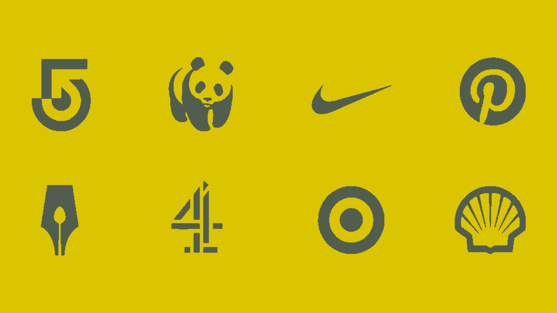
When people think about logo design, there’s often an assumption that more detail means more meaning. But in practice, the opposite tends to be true. The logos that work best…

Organizations naturally evolve. They grow, expand their services, and often reach audiences they didn’t originally anticipate. But brands don’t always evolve at the same pace. When a brand falls out…

As with any project, planning can help you save money and time on your web project. Here are some tips that can help you prepare for a successful web design…

Replace or repair? First, do no harm. In many cases, it makes sense to modify rather than replace a logo design. A logo modification can correct issues that are not working in the existing logo…
Some organizations use the same logo for years without needing to change them. Others seem to restlessly change them every few years. A logo is always an investment. Nothing says more about…

“all websites look the same” It was a long time coming, but the tools for creating responsive websites work, and work very well. Perhaps too well, because the approach people use for building websites…

When are you finished with your website? You never are, a challenge that makes it difficult to measure progress or evaluate results when a website project is in the works. As a result,…

The process of selecting a web design agency can be difficult. An abundance of companies, technologies, and processes make the selection process challenging and confusing. And with your website often being the first…

time, quality, money A time-honored project management principal is that you can pick only two of the above for any project. Whether this is idea is true or not, the concept of framing…

First do no harm! A rebranding process is an opportunity to rethink and realign your organization’s core marketing and communications. It brings assumptions and challenges into the forefront and opens the door to planning…
Brand building success. As traditional media is eclipsed by new media, the concept of brand building continues to change in unexpected ways. Speed, adaptability, and collaboration are more important than…

six things to look for in a website redesign Every website is different; yet, the best sites always have a few things in common. As you consider a website redesign…

paying attention to your audience We recently offered to make a referral to a partner company that was declined because of terminology. The client wanted “SEO,” the company didn’t want…

approaches for creating value and awareness while dispelling confusion A big part of writing and design is taking complicated messages and making them easy to understand, but also making them interesting…

the cost of complexity Keeping your website and social media feeds up to date can be time-consuming and complicated, so it’s worth taking a little time to invest in a planning process to…
Out of all the contest entries, we had 11 that matched all the dancing skeleton illustrations to the correct movie. From the 11 that answered all correctly, Alexandra Wiley was randomly selected…

how web design and messaging can strengthen your brand The most valuable piece of property in the world is the seven square inches your prospective client sees when pulling up…